Nano Banana 2 Lite Prompt Guide: Real Examples for Editorial Images, Text, and Creative Workflows
A practical Nano Banana 2 Lite prompt guide based on real VibeArt canvas generations with Gemini 3.1 Flash Lite Image, covering editorial visuals, short text, lifestyle scenes, style control, and prompt structure.
July 6, 2026
•By VibeArt Team•
12 min read
•— views
If you have already tested Z-Image Turbo, the useful question about Nano Banana 2 Lite is not whether it can make images. The better question is:
Where does it fit inside a real creative workflow?
This guide is based on a real VibeArt canvas generation set. The model ID used in the test was gemini-3.1-flash-lite-image, shown in VibeArt as Gemini 3.1 Flash Lite. For creator-facing readability, this article refers to that lightweight image route as Nano Banana 2 Lite.
This is not an official spec page, and it is not a synthetic benchmark. It is a practical prompt guide: which prompts produced publishable images, where the model felt thin, and how to write richer prompts when the first pass is too clean.
Quick Answer: What Nano Banana 2 Lite Is Best For
In this test, Nano Banana 2 Lite worked best for:
fast editorial direction finding
AI tools, creative workflow, and content production visuals
short physical text tests, such as signage
lifestyle still lifes, studio desks, and workflow props
style exploration, including manga, watercolor, and 3D product objects
first-pass visual exploration before upgrading to a stronger model
Its weaker spots were also clear:
first-pass images can feel too clean or sparse
complex isometric worlds were unstable in this run
manga-style images still produced fake marks even with no-text constraints
compared with our Z-Image Turbo guide, it needed more prompt structure to reach similar visual density
So I would not position it as the strongest final-image model. I would treat it as a lightweight exploration model: fast enough to branch ideas, useful enough to compare directions, but dependent on prompt structure when you want richer images.
How We Built This Canvas
We started by adapting the structure of our Z-Image Turbo Prompt Guide: hero image, short text, instruction following, editorial metaphor, social cover, lifestyle scene, style control, and product asset.
The first pass was usable, but it felt too much like a model capability sheet. The images were clean, but not as rich as the Z-Image Turbo examples.
So we changed the prompt strategy:
Write each prompt as a publishable image brief, not a capability test
Specify foreground, midground, and background
Add material, lighting, character, environment, and visual conflict
Use specific scenes instead of abstract product concepts
When a complex prompt failed, simplify the scene rather than retrying the same shape
The result was a much stronger set.
The Prompt Template That Helped Most
If you write:
AI image generation workflow illustration, yellow theme, no text
the result will often feel thin.
A better structure for Nano Banana 2 Lite is:
[image type] for [use case].Foreground: [specific objects or action].Midground: [main subject or relationship].Background: [environment, depth, atmosphere].[material cues], [lighting], [palette], [production constraints].No readable text, no logos, no watermark.
The point is simple: do not just give the model a topic. Give it a usable visual structure.
1. Hero Image: Creative War Room, Not Generic AI Tool
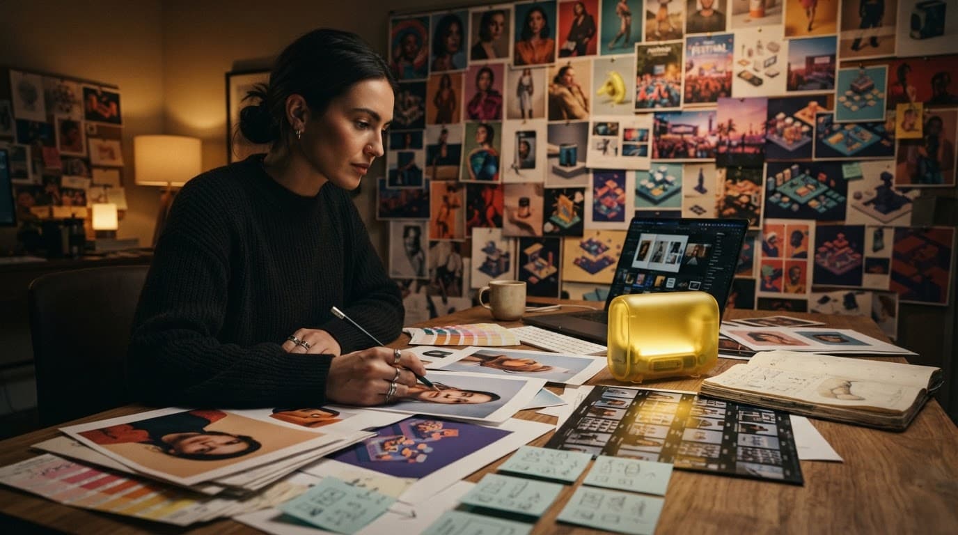
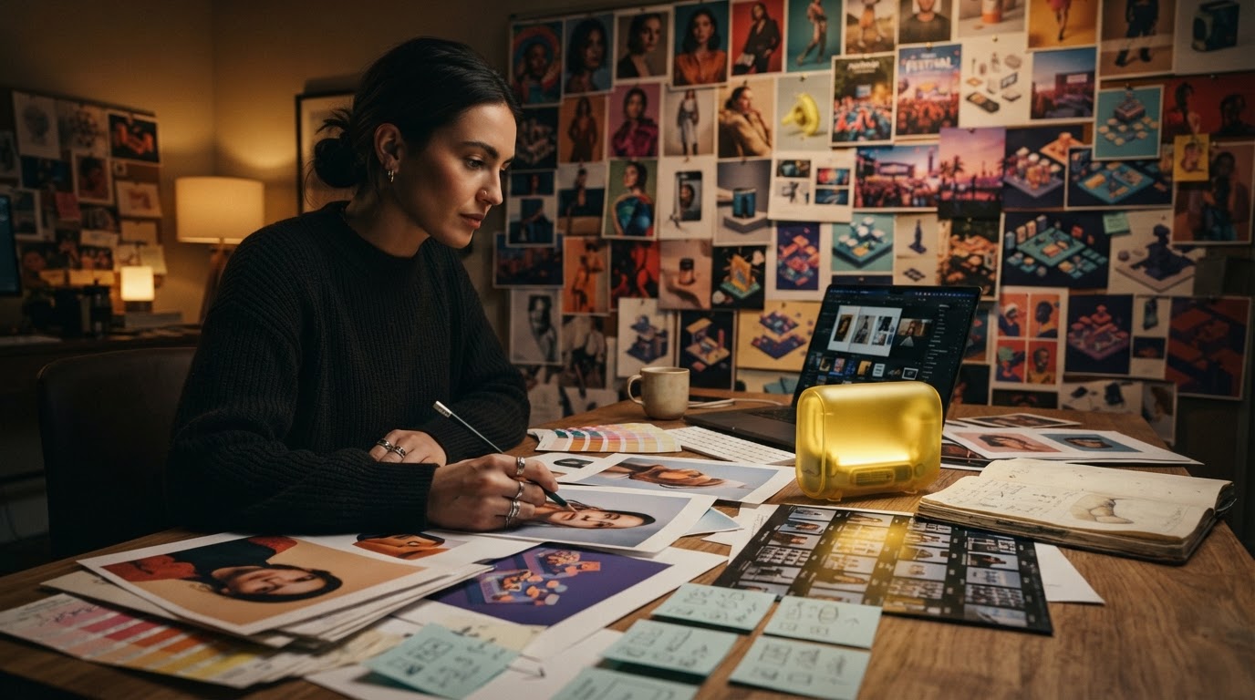
This is the strongest hero candidate from the richer pass. It works because it shows a workflow, not just a glowing object.
The image has:
printed drafts and color chips on the table
a compact yellow glass AI engine in the middle
a wall of visual options in the background
a human making choices, not just staring at a screen
Prompt:
Magazine-quality hero image for a Nano Banana 2 Lite prompt guide, set inside a late-night creative war room. Foreground: a designer holding a pencil over a table covered with printed image drafts, color chips, camera contact sheets, and sticky composition thumbnails. Midground: a compact translucent banana-yellow AI engine glowing beside a laptop. Background: a full wall of diverse generated visuals arranged like an art director review board: portraits, product shots, festival still lifes, isometric assets, and social covers, all visibly different. Rich layered composition, cinematic depth, premium editorial lighting, graphite shadows, warm yellow highlights, tactile paper and glass textures. No readable text, no logo, no watermark.
The lesson: with Lite models, break "richness" into executable layers instead of only saying rich or cinematic.
2. Complex Character: Clothing, Materials, and Environment
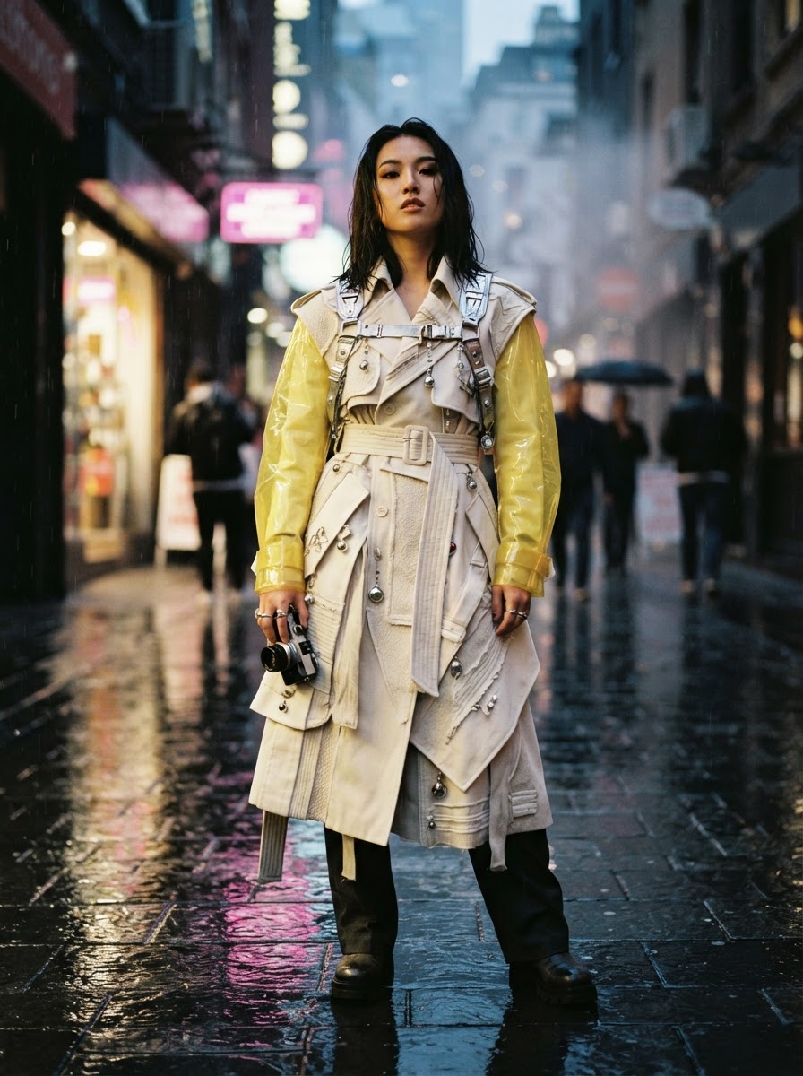
This image tested complex instruction following. The character, layered coat, translucent yellow sleeves, camera harness, wet pavement, and evening alley all came through.
It is not the most luxurious fashion image possible, but it is strong enough to show that the model can handle a detailed human editorial prompt when the visual relationships are explicit.
Prompt:
High-fashion editorial portrait testing complex instruction following for a lightweight image model. A young East Asian creative director stands in a rain-glossed city alley at dusk wearing a sculptural cream trench coat with banana-yellow translucent sleeves, silver camera harness, layered fabric textures, small glass charms, and wet pavement reflections. Foreground raindrops and blurred neon bokeh, midground confident full-body pose, background narrow street with warm shop lights and mist. Photorealistic, cinematic fashion magazine quality, intricate clothing detail, expressive face, no readable text, no logos, no watermark.
For this type of prompt, the important parts are:
character role
garment structure
material cues
environmental lighting
depth and camera mood
3. Short Text: Better on Signage Than Long Posters
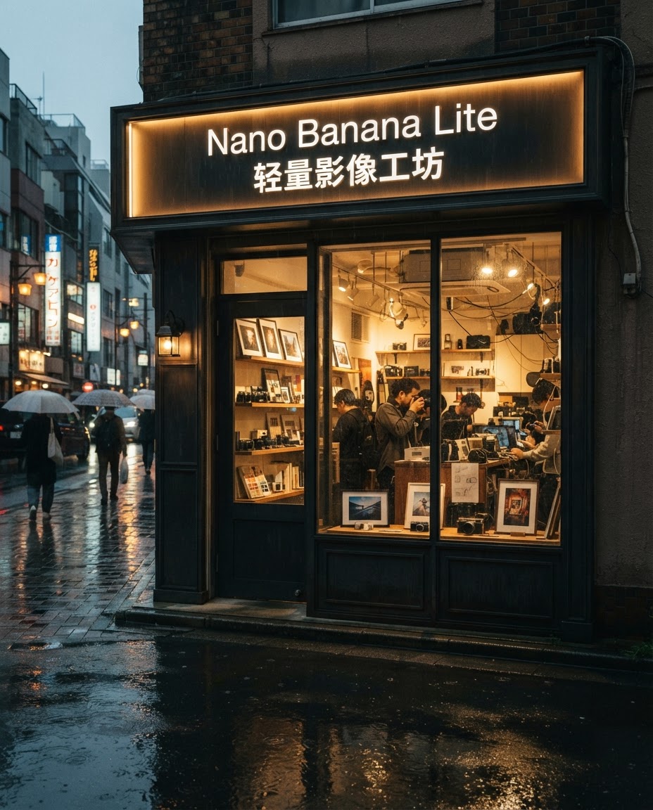
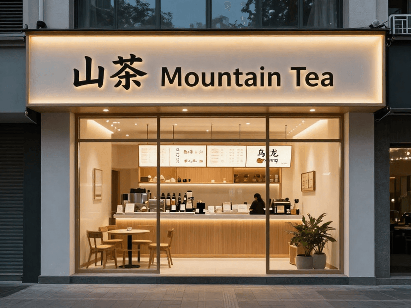
For text rendering, this storefront result was more useful than a generic poster. The text is part of a physical sign, which makes the image feel less like a flat text test.
Prompt:
Photorealistic boutique creative studio storefront at dusk, designed as a premium brand space for a lightweight AI image model. Rainy pavement reflections, warm interior shelves with printed images, color swatches, small cameras, and paper mockups visible through glass. Storefront sign contains exactly two readable text lines only: English "Nano Banana Lite" and Chinese "轻量影像工坊". No other readable text anywhere, no logo clutter, no watermark. Elegant typography integrated into the physical sign, rich cinematic street photography, deep shadows and warm yellow interior light.
This suggests a practical rule: keep text short, physical, and constrained.
Use:
storefront signs
packaging fronts
simple cards
two to four short text elements
Avoid starting with long posters, menus, or multi-level ad layouts.
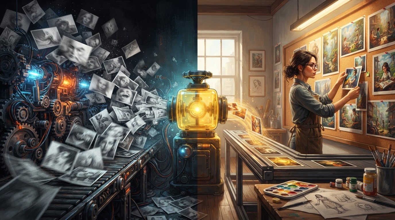
4. Editorial Metaphor: Speed Versus Craft
This is one of the most useful directions because it has a point of view. It is not just an "AI tool image." It visualizes a real editorial argument: speed is not enough; the value comes from turning chaotic output into useful drafts.
Prompt:
Opinion article cover metaphor about speed versus craft in AI image generation. Split cinematic composition: left side shows a chaotic conveyor belt throwing out pale unfinished image tiles; right side shows a calm art director selecting a few vivid finished visuals and pinning them to a warm review wall. In the center, a compact yellow glass engine acts like a valve that slows chaos into useful drafts. Strong symbolic contrast, layered foreground machinery, midground human decision, background glowing canvas wall, premium digital editorial painting, no readable text, no logos, no watermark.
This type of image works well for blog covers, newsletter headers, and opinion pieces. The trick is to translate the argument into a visual conflict.
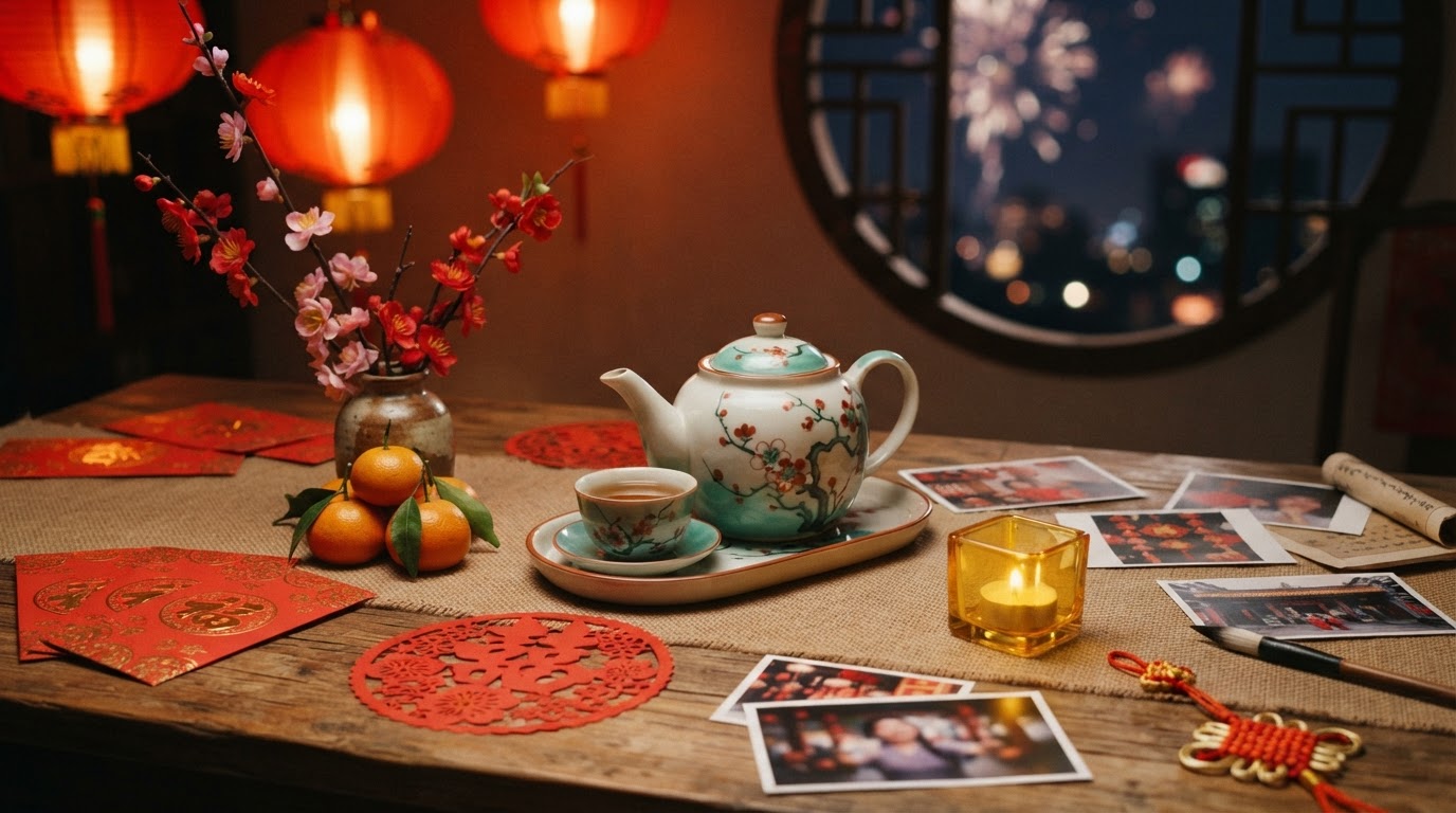
5. Cultural Semantics: Chinese New Year Still Life
The first version of this prompt failed because it was too long and tried to carry too many constraints. A shorter rewrite worked better.
Prompt:
Rich Chinese New Year editorial still life photographed on a wooden creative desk. Red envelopes, tangerines, porcelain tea, plum blossoms, paper-cut patterns, printed image drafts, and a small banana-yellow glass cube arranged naturally under warm lantern light. Round window in the background with soft fireworks bokeh. Dense festive details, authentic composition, red, jade green, porcelain white, banana-yellow accents. No readable writing, no logos, no watermark.
The lesson: do not just write Chinese New Year atmosphere. Name the objects and their relationships:
red envelopes
tangerines
porcelain tea
plum blossoms
round window
lantern light
That gives the model a culturally coherent scene instead of a generic festival collage.
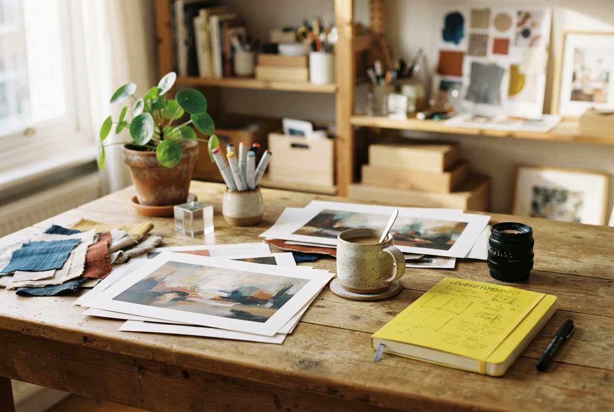
6. Lifestyle Desk: Removing Hands and Screens Made It Better
We first tried a lifestyle scene with hands, laptop thumbnails, a tablet, props, and no readable UI text. That version failed twice. The simpler still-life version worked.
Prompt:
Warm creative studio desk still life in morning light. Printed AI image drafts, fabric samples, color markers, ceramic coffee, camera lens, banana-yellow notebook, small glass cube tool, and potted plant arranged on a wooden table. Background shelves with props and mood boards blurred into soft bokeh. Rich tactile paper, wood, glass, ceramic, and fabric textures, editorial photography, no readable text, no logos, no watermark.
This is a useful boundary. Nano Banana 2 Lite can make convincing creative workflow atmosphere, but if you ask for hands, screens, UI, many props, and no text all at once, the generation can become unstable. Split the task.
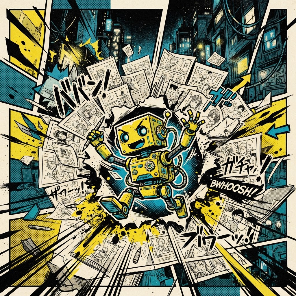
7. Style Control: Manga Works, But Fake Text Is Still a Risk
The manga-style result is visually strong. It picked up speed lines, halftone dots, panel borders, and the yellow-black-cyan palette.
But it also shows a limitation: even with no letters, no numbers, the image still contains fake manga marks.
Prompt:
Bold Japanese magazine manga cover style without readable text: a tiny yellow studio assistant robot bursts through a collage of image drafts, ink speed lines, halftone dots, dramatic panel borders, and high-contrast cream, black, cyan, and banana-yellow color blocks. Foreground expressive robot pose with paint splashes, midground flying composition thumbnails, background abstract city studio lights. Clear graphic richness, sharp ink outlines, print texture, no letters, no numbers, no logos, no watermark.
This is valuable for style exploration, but I would not use it as a no-text production image without editing or another pass.
8. 3D Product Object: Easier Than a Complex Isometric World
We originally tried to generate a complex isometric miniature world with four zones. It failed twice. Reframing the task as a single 3D diorama worked much better.
Prompt:
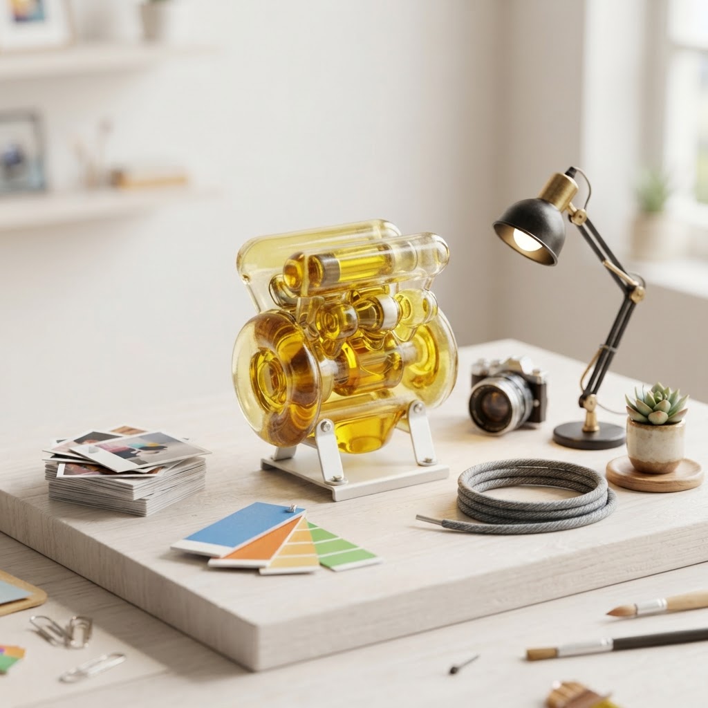
Detailed 3D miniature product diorama for a creative AI tool. A small banana-yellow glass engine sits on a pale studio platform, surrounded by tiny printed image cards, color swatches, camera lens, desk lamp, cable coil, and a potted plant. Polished toy-like render, rich glass, paper, plastic, metal, and ceramic textures, soft shadows, full object visible, clean background, no readable text, no logo, no watermark.
If you want onboarding or landing-page assets from Nano Banana 2 Lite, start with one rich object before asking for a whole world.
How It Compares With Z-Image Turbo
Compared with the images in our Z-Image Turbo guide, the first Nano Banana 2 Lite pass felt noticeably thinner. Z-Image Turbo often reached a stronger editorial read with less prompt scaffolding, especially for metaphor images, seasonal still lifes, and stylized assets.
But after rewriting the prompts, Lite produced a useful set. Its strengths are different:
it is useful as a low-cost exploration layer
it responds well to photography, people, short text, and workflow scenes
it benefits from VibeArt's canvas-based iteration loop
it can quickly reveal which direction deserves a stronger model
Its limits are also clear:
it needs more structured prompts
complex multi-zone scenes are less stable
fake text can appear in graphic styles
if you want the first image to feel highly finished, a stronger model may be better
Practical Prompt Summary
If you want to try Nano Banana 2 Lite in VibeArt, start with this pattern:
[Specific image type] for [real publishing use case].Foreground: [concrete action or objects].Midground: [main subject and visual relationship].Background: [environment, depth, light, atmosphere].Rich [materials], [palette], [mood], [camera or illustration style].No readable text, no logos, no watermark.
When a result feels thin, do not just add ultra detailed. Add:
foreground object
midground subject
background environment
material texture
lighting direction
visual conflict
real use case
Final Takeaway
Nano Banana 2 Lite is not the first model I would choose for final hero-image polishing. But it is very useful for one job:
turning a content idea into a set of comparable visual directions quickly.
Its best role is not one-shot perfection. Its best role is fast branching:
hero image direction
short text test
character scene
editorial metaphor
seasonal still life
workflow desk
style exploration
3D product object
Then the VibeArt canvas becomes the decision surface: which image deserves another prompt, which direction deserves a stronger model, and which idea is good enough to ship.
That is the practical place for a lightweight image model inside a real creative workflow.